I wrote an article about great albums with awful cover art a while back, but sometimes a band can consistently release great albums and still plaster a lousy logo on every one of them. Not every band needs to have an unreadable logo that looks like this…

…but considering all of the below bands have their own unique sounds, they could have at least stood to have more unique logos to match.
5. Ophis

Look, I understand the obsession in metal with incorporating inverted crosses and pentagrams into your logo at every chance you get. But couldn’t Ophis have had their graphic designer do more than just that before calling it a day?
Okay, I guess they turned the “S” into a snake, added a few spikes, and made sure the letters were a little jagged, but come on. This is just boring. And as someone who takes pride in defending doom metal from accusations of being boring, Ophis is not making my job any easier. They couldn’t have made the letters bolder? Thicker? More menacing? You know, doomier?
And not to pick on doom metal bands in particular, but…
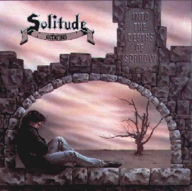
4. Solitude Aeturnus

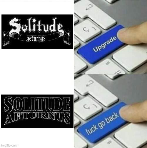
If you think this logo looks like someone hand drew it with a pencil for one of their early demo tapes, you’d be correct. And as far as hand-drawn amateur logos go, this one is pretty good. However, you’d think that once they were signed to major metal label Roadrunner Records, they’d go for a more professional logo. But I guess Roadrunner either wouldn’t cover the expense or none of the parties involved deemed it necessary, since the two records Solitude Aeturnus released on Roadrunner have the same logo from the demo.
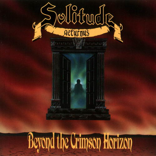
The band signed to a new label after their first two records, and with a new label came a new logo. Surely this new one would do them justice, right? Ehhhh…

This logo change almost made my “worse metal band logo changes” list, but ultimately didn’t make the cut because I genuinely couldn’t decide if I even disliked the new logo more than the old. Now that I’m revisiting the subject, I’ve decided that this new logo is still a downgrade. Sure, it’s more professional, but it’s boring! Serif font with a bit of an arch at the bottom. None of the grit that characterizes Solitude Aeturnus’s sound is present in this logo. I can’t believe I’m saying this, but…
Fortunately, it seems like at least a few people in the band and/or their current label agree with me, since they’re using the old logo on their Facebook page and the poster for their first live performance in years.
3. Bewitcher

Like I said before, I understand some metal bands’ insistence on incorporating inverted crosses into their logos. I also understand the need to make the logo appear symmetrical, even though the letters themselves aren’t. Just look at my own logo at the top of the page.
But apparently no one thought to point out that the word “Bewitcher” already has the letter “T” directly in the middle of the word! If the above two criteria were really so important for the band’s logo, wouldn’t it have made the most sense to make the letter “T” look like an inverted cross? Talk about a missed opportunity.
If the letter “T” was off-limits for some reason, no worries. There are plenty other letters in the English language that have a vertical line with nothing attached to the bottom where one can easily add an inverted cross. Bewitcher’s logo accomplishes this here with the lower-case “R.”
However, thanks to the above insistence on making the logo appear symmetrical, it also includes an inverted cross on the lower-case “B,” turning themselves into Pewitcher.

2. Goatmoon

This logo was my inspiration for this entire list, and I’m not the only one who feels this way. It’s so bad, Hipster Black Metal on YouTube said it looks like something “scribbled on the back of a high school notebook when you have a boring day in math class.” There’s not much more I can add to that assessment.
1. Type O Negative
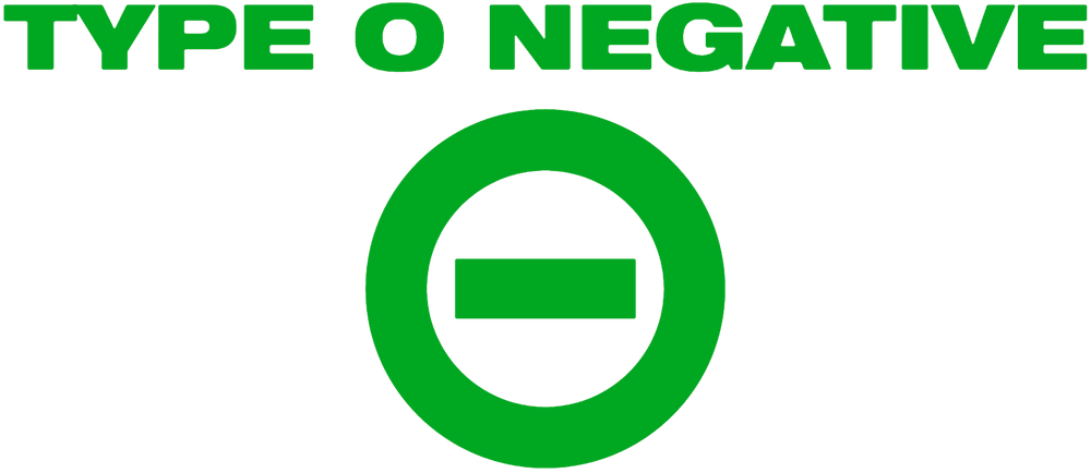
Ironically, the biggest band on this list by far also makes the number 1 spot for worst logo. It’s green! No surprise there, given how obsessed frontman Peter Steele was with the color. And it’s, uh…in a sans serif typeface!
At least the typeface is bold, I guess.
But why didn’t they put the only cool part of the logo, the hyphen in the letter “O,” in the actual text of the band name? While every other metal band in the world was trying to put 666, pentagrams, and inverted crosses into the letters of their logos regardless of whether it made sense (see Bewitcher), Type O Negative could have actually done something unique with the text of their logo.
What’s worse, the hyphenated “O” was the inspiration behind the band name in the first place. This part of the logo was conceived of when the band was called Sub-Zero, but they had to change the name on account of another band already holding rights to the name. Unfortunately, all four members had already gotten tattoos of the hyphenated “O,” so they had to think of another band name that still fit their terrible decision artistic choice. Thus, Type O Negative was born.
It’s not that I have anything against the band’s minimalist visual presentation. The World Coming Down album cover is probably one of my favorite album covers, and all it is is the Brooklyn Bridge with a green filter.

Steele was pretty meticulous when it came to detail, so I doubt he chose the logo on a whim. He even went as far as to spend hours going through hundreds of different shades of green to find just the right one for the Bloody Kisses cover. Did he spend the same amount of time picking the typeface for his band’s logo? Actually, that might explain it if he did, since I think the shade he picked for the Bloody Kisses cover is too pale.

One Reply to “Five Bands Who Sound Better Than Their Logos Look”