Despite me branding myself as the only real metalhead (which is true, shut up), I am actually pretty open-minded when it comes to metal bands experimenting with their sound. Hell, my favorite band is Katatonia. Not only are they my favorite band, I’ll even go as far as to say they have never released a bad album, even with their continuously changing sound.
But just because I grant them permission to change their sound does not mean they can go around changing their logo all willy-nilly! I don’t care that a band’s image should reflect its sound and should change with the sound accordingly. I still want to see the exact same logo that the band had designed when they had barely become legal adults (if that) on every single album, every single t-shirt, every tour poster, and every other piece of band merch until the heat death of the universe. Is that too much to ask?
Okay, because I’m such a nice guy, I’ll limit the bands who need to erase their new logos from the annals of history to the following:
Katatonia
This list is in no particular order, but since I’m on the subject of Katatonia I may as well start with them, especially since they had the audacity to downgrade their logo not once, but twice.
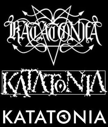
I may as well be looking at an evolution of the Mozilla Firefox logo.
Their first, coolest logo has a Satanic pentagram, just like a gajillion other metal bands in the early 90s (and beyond). The lettering looks like the Old English font, also just like innumerable other metal bands of the era, especially in Scandinavia. And you know what? That look was popular for a reason: it ROCKED!
Katatonia adopted their second logo with the Saw You Drown EP in 1998 to coincide with their move from blackened death/doom to a more gothic doom sound, employing almost entirely clean singing as opposed to growling or screaming. Before I criticize it I’ll give credit where it’s due: the jagged typeface makes it easily identifiable as a metal band logo from the late 90s and early 2000s while still appearing distinct. However, any non-metal chump can read it as easily as I can, which instantly makes me hate it.
The band didn’t have a consistent logo from about 2006, the beginning of The Great Cold Distance album cycle, to about 2012 judging by the records and tour posters released during that period. They instead used a variety of sans-serif typefaces which were all equally boring.
They at least had the courtesy to add the silhouette of a flying bird in the letter “O” upon 2013’s live album Last Fair Day Gone Night, making it what I guess you could call a proper logo. Does it fit the band’s more recent alt-metal sound? Yes. Does that make me like it any more? No. I’m a metalhead and refuse to grow up.
Hypocrisy
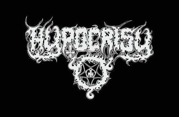
Old logo: check it out! It’s another Scandinavian metal band from the early 90s with a Satanic pentagram in its logo! But not only that, the pentagram has an inverted cross in the center! Or is it a Celtic iron cross? Who cares, it’s cool! Wait a minute, what’s that? Could that be another inverted (or Celtic) cross underneath the letter P? I think it is! No freaking way! A metal band logo with a pentagram and two inverted/Celtic crosses? These guys must be the evilest, most Satanic motherfuckers in a scene full of evil Satanic motherfuckers! My pre-algebra teacher will totally send me to the principal’s office if I wear this band’s shirt to class! Hold on, do those three loops around the pentagram make a “666?” This is almost too much badassery to handle!
New logo: what’s that? Hypocrisy sings about aliens now? Uh, that’s cool, I guess. But their logo is still illegible, right? No? Okay, but will it get me sent to the principal’s office? Yes, I know I dropped out to pursue a career in ditch-digging years ago, but that’s not the point. Just answer the question. No? Okay…
Impending Doom

Old logo: My mom can’t read their logo so they must be sick!

New logo: My mom can read their logo now. And she can even understand like 10% of the lyrics! She’s not even offended by any of them!
God Dethroned
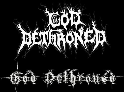
The top logo was short-lived, only appearing on a few early releases from the band’s founding in 1991 to 1992 (and a 2000 compilation album consisting of tracks from said early releases). But what God Dethroned’s first logo lacks in longevity it makes up for in grit. There’s simply no better word to describe it. Just look how spiky it is! They point everywhere! There’s an outline of the Grim Reaper in the letter G! The letter H not only has an inverted cross in it, but also a devil’s tail! You can tell this is the logo of a young death metal band full of piss and vinegar who are about to tear your face off with their raw, Satanic energy.
The lower logo is the logo of a black/death metal band who has toured a few times, gone through a few lineup changes, and has spent a little more time smelling each others’ farts in a cramped tour van than they ever thought possible. They now have a more, refined sound, and needed a newer, more refined logo. The grit of the first logo has been replaced with clearer-defined lines in the lettering and spikes that only make geometrical sense. No inverted crosses or devil’s tails to be found anywhere.
God Dethroned updated their logo again in 2017. Just look at this monstrosity:
Look how clearly-defined the lines are! How the dismally few spikes point in the same way as the lettering! It almost makes you want to cry.
Lord Belial

You already know everything I’m going to say at this point.
Death

I’ve already praised the gritty artwork of all the previous original band logos, and the same applies here. However, that’s not the main reason I included this seminal band’s logo in my list. In addition to a creepy spider spinning his web and what is probably blood dripping off the logo, Death’s original logo contains the Grim Reaper, aka the personification of death, peaking out over the letter H. Now let’s take a look at their newer logo:
What’s missing here? Practically everything that made the original logo cool, I know. Damn near every complaint I’ve leveled against all the previous logo changes also applies to this. In writing this I just realized for the first time that they even adjusted the letter T so it no longer resembles an inverted cross. Lame! But by far the worse offense of this logo change is the band’s now-absent namesake. Where is the Grim Reaper? Where is death? All that’s left is his now-immaculately clean scythe. For shame.
Counterexample: Rotting Christ
“Okay Ian, we get it,” you’re probably thinking, “As bands mature, they start to lose their edge and opt for cleaner logos. But this is inevitable. You can’t expect a band will continue to like the logo they paid $20 for a friend of a friend to draw when they were teenagers. Especially when their sound has changed throughout decades and no longer reflects the look of their old logo.”
Actually, yes I can. Rotting Christ stuck with their sick original logo, so every other band should as well:
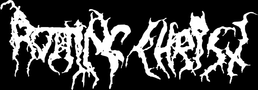
Although this wasn’t the very first logo Rotting Christ used (they used another rough one in their first demo), the above logo appeared on their second demo released in 1989 and has been their logo ever since. A friend once said it looked like the way the aliens from the movie Arrival communicated, and I cannot think of a more apt comparison.
The band’s sound has changed from raw black metal in their early days to a more gothic doom sound now. Just like all the previous bands in this article, I entirely believe they grew into their new sound. I eagerly anticipate each new Rotting Christ album and dutifully see them live whenever they grace my city with their presence.
I also believe their logo still perfectly suits their new sounds just as much as it did their old material, and if they ever have the audacity to change it I will piss and moan and pout in the corner. Like a metalhead is supposed to do.
The Exception: Cannibal Corpse
After working myself up over bands who change their logos to fit their changing sounds, it figures that one of the few bands whose new logo is an improvement has not once changed their sound in over three decades as a band: Cannibal Corpse.
Oh boy, here come the Cannibal Corpse fans to split hairs and tell me I’m wrong because each album has slightly cleaner production than the last or some crap. Come on, guys. If Cannibal Corpse actually changed their sound in any meaningful way you’d throw a worse fit than I would if Rotting Christ changed their logo. You like them because you know exactly what you’ll be getting each time: disgusting death metal about people dying in horrible ways. That’s why I like them, too.
But no, I haven’t forgotten about the only notable excuse for a sound change in the band’s entire history, as that prompted the only good logo change in the history of metal:
The reason for the logo change is original vocalist Chris Barnes designed the original logo. After the band fired him, they did not want to give Barnes the excuse to claim any rights over the logo’s usage, so they had a new one designed.
You might be thinking “Ian, this logo change is has all the same features of all the other logo changes you’ve criticized! The first logo is dirtier and grittier, whereas the newer one is cleaner and more legible. What gives?”
You’re not wrong, but while the other original logos looks like one of the band members paid $20 to have a friend of a friend design them, Cannibal Corpse literally drew it themselves. It shows. It’s the metal band logo equivalent of duct tape DIY home repair. Sometimes it’s just better to hire someone who at least owns a tube of caulk. This analogy sucks, but now I’m too busy chuckling at the word “caulk” to think of a better one.
I see the devil