Making an album is hard. I’ve never done it, of course, because I have a real job. But I’ve listened to enough crappy albums to know how hard it must be to make a good one. You’ve already had to collaborate with your idiot bandmates, the producer, the various studio techs, your record label, to finally release your work to the world. Except how are your fans going to know what to buy? The trick System of a Down pulled with Steal This Album! only worked once. You’re going to need some original artwork for your album. Let’s hope you got a better artist than the ones who made these:
Illdisposed – Four Depressive Seasons
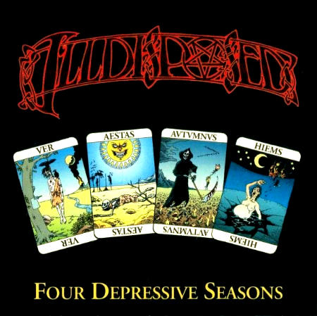
One might be able to forgive Danish death metal outfit Illdisposed for the artwork of Four Depressive Seasons. It was their first album, released on a small record label, and limited to only 500 copies. Fortunately, Illdisposed didn’t let the “first album” excuse get in the way of them recording an excellent record, but their record label and the artist they commissioned to do the artwork sure did.
As bad as the artwork itself is, let me start by criticizing the lack of art on the album cover. Look at all that empty space! The artists (yes, this artwork is the collaborative effort of two people) couldn’t have thought of a more creative way to fill in the cover? They made not one, but four images to adorn it, but couldn’t have beeb bothered to make them fit the space they were given? Maybe they figured that since the art they did make was so crappy, they needed it to be as small as possible so no one would notice how bad it was. If that was their aim, they failed. I noticed. I notice everything. I am the all-seeing eye of Sauron, if Sauron were a metalhead blogger who roasted album art and just spilled ink all over his face from the pen he was chewing.
Trying to make your lousy artwork smaller so it’s harder to tell how lousy it is is the same logic my childhood friend Liam tried to employ when a teacher asked him a question he didn’t know the answer to. He mumbled his answer as quiet as possible so he wouldn’t look like an idiot in front of the class. Except this only made him look like an idiot who couldn’t speak properly. Likewise, all this empty space just makes the artists look like sloppy artists who couldn’t fill in the space they were given properly.
If you strain your eyes enough to look at the actual art, you’ll notice there are four images resembling tarot cards, one for each season, beginning with spring. This immediately triggers my obsessive-compulsive side, since a quick glance at the album’s track listing reveals that the album begins with a song about summer, with every other subsequent track being about the following seasons. You’d think the artists didn’t even bother to look at the track listing, much less listen to the album, before they made its cover art.
Ignoring the out-of-sync order of the seasons, we come first to spring’s tarot card. We see a man (Or woman. Who can tell, and who cares?), long dead, hanging from a tree with crows eating his/her dead flesh. Since it’s springtime, someone has tapped the tree for sap. Right next to the dead body. Also, there’s a smoking volcano in the background for some reason.
Our summer tarot card contains a giant, evil sun grinning over an arid landscape with a skeleton of someone who presumably died of dehydration. It’s hard not to laugh at this image.
It’s a little hard to tell what’s going on in the autumn tarot card (again, thank the artists for making the images so damn small), but it appears to be the Grim Reaper using his scythe to reap the plant-hands growing from the ground. One of the plant-hands seems to be flying through the air. Maybe from the momentum of the Grim Reaper swinging his scythe, or maybe because it’s suspended in mid-air. There is no answer that would make this picture any less absurd. There’s also a flock of birds migrating south so you know it’s autumn, and a volcano in the background again. Because volcanoes are also around in autumn, I guess.
Lastly, our winter tarot card features a pregnant woman who must have been walking naked on a frozen lake in the middle of the night for some reason, only for the ice to break under her, pulling her into the icy water. There are some guys holding torches in the background. Are they trying to rescue her? I doubt it, that wouldn’t be very metal. Did they throw her in there? Is this how the band’s viking ancestors treated their pregnant women to ensure they birthed strong, warrior sons? I don’t know, all I know is this art is stupid.
Vital Remains – Let Us Pray
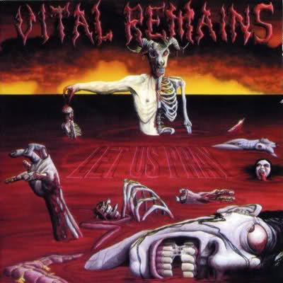
Look, I don’t have it in for Vital Remains, even after I baselessly accused them in a previous blog post for not touring due to drug addiction. I later learned the Tony, their guitarist, has been dealing with some serious health problems, which made me feel like an even bigger jerk. But not enough to not make fun of this album art.
This is another case of “band’s first album with a minor label limited to 500 copies,” and boy, does it show. It contains human bodies in various states of dismemberment, floating in a lake of blood. There is some kind of devil in the center with half his body missing, holding one of the other bodies with his one fleshy arm. Very death metal.
But who or what caused all this gore? Was it this devil-like figure? It certainly seems like it considering it is holding one of the dismembered corpses. By why would it tear off half of its own body as well? Wouldn’t that make it half as efficient for goring puny humans?
Why is there so much blood but comparatively few chunks of bodies floating in it? I don’t know the dimensions of this blood lake, but it seems pretty wide and the devil-figure, which appears larger than the humans it probably killed, is standing waist-deep in it. Surely more bodies than those we see would be required to yield that amount of blood. Could they have sunk to the bottom of the blood lake? That would make sense if the devil-figure (or whatever dismembered the bodies) cut them open to release the gut bacteria, which would normally cause the body to float to the surface. However, the body in the front of the picture seems to have its ribcage ripped out with entrails floating in the blood, more than sufficient to release the gut bacteria. The decapitated body of a woman on the right looks like its abdomen is in tact, which would explain the floating, but it would appear the severed head of that body, which contains no gut bacteria, is also floating in the blood next to it.
It’s like the artist didn’t even ask himself these questions when he made this. We, as metalheads, should demand more of our gory album artwork. And speaking of gory album artwork…
Cannibal Corpse – Kill
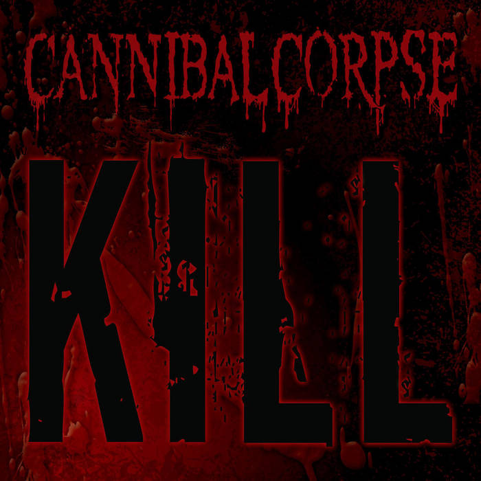
…Let’s continue with a gore-free album cover by a band notoriously known for its gory album covers.
This is a rare case where I actually know the backstory behind the album art as opposed to wildly speculating the least charitable explanation for why it’s trash. Vince Locke, who did the artwork for every Cannibal Corpse album, originally made this as the album art:
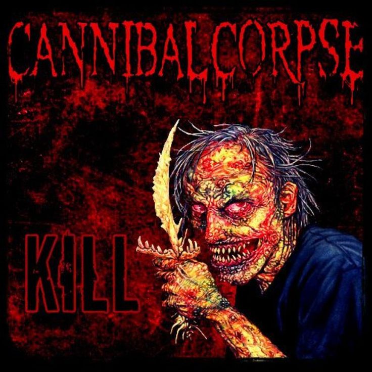
However, the band was not all in agreement about using it on the album. Since there wasn’t enough time for Price to design a new album cover, the band opted to use the design with just the band logo and album title and included Price’s art in the inside cover of the album. Although the artwork wouldn’t have been my favorite Cannibal Corpse cover art had they used it, by not using it at all they guaranteed it would be my least favorite cover art.
The band reasoned that after releasing several albums with gorily detailed artwork, they should try to let the music stand on its own. Good thing it did, because not only is this their worst album cover, it’s plastered with their least original album title in bold font. Kill. Get it? Because Cannibal Corpse’s music is about killing? And while I’m on the subject of one-trick ponies…
Dark Funeral – Vobiscum Satanas
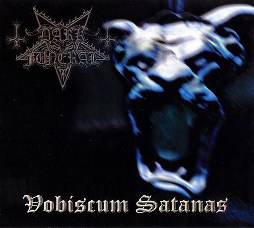
Unlike the first two entries, I am not ripping on a band’s first album that had a limited release on a small record label. Because not only is Vobiscum Satanas Dark Funeral’s wide-release sophomore album, its cover art is far worse than their first album, The Secrets of the Black Arts, which was released on the same label. Did the first album not sell as well as the label hoped, so they tried to rebrand? Considering all but the band’s lead guitarist had changed between the first album and this one, it wouldn’t have been out of the question.
Except when you listen to both albums and realize they still sound more or less the same. If anything, the previous album is a little better. Maybe the band went for a downgrade in album art to reflect the downgrade in their music. Then fans would be happily surprised when they played this and found the musical downgrade wasn’t nearly as bad as the downgrade in album art!
Perhaps I’m not giving Dark Funeral enough credit. For a band that whose main schtick has always been to write above-average black metal that doesn’t challenge convention, the Vobiscum Satanas album artwork might be the biggest risk Dark Funeral has ever taken. After this album, they released three albums in a row that were all red with some kind of demon on the cover, before returning to the roots of their first album by releasing two more blue albums with hooded figures. Compared to that, this blurry gargoyle on a black background is innovative and fresh by comparison. No matter they never had another album cover like that again. And speaking of gargoyles…
Rotting Christ – Κατά τον δαίμονα εαυτού
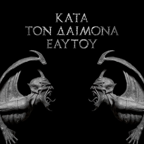
The art for Κατά τον δαίμονα εαυτού might ironically be one of the better Rotting Christ album covers, but compared to the music itself the artwork leaves much to be desired. It’s almost entirely black. Unlike Four Depressive Seasons, which suffers from too much blank space but had sufficient art that could have filled in the space better, all we get with Κατά τον δαίμονα εαυτού is two gargoyles and the album title. I can’t help but think the artwork is incomplete.
The sound of the album, however, could not be more complete. It is beautifully mastered, features a few guest musicians, and even a choral ensemble, making you feel you’re in some kind of trippy black mass bastardization of a Greek Orthodox church service. I understand the artistic value in contrasting your music with the art that accompanies it, but this doesn’t seem like one of those times, considering Rotting Christ’s previous two albums sound similar, but with more maximalist art.
Also, I don’t much care for the gargoyles’ obscene tongue gestures. How dare they defile my Rotting Christ album with such vulgarity!
–
My first idea to conclude this post was to speculate that AI-generated art would eventually replace metal album cover art. But then I remembered that metal bands have had the option to outsource their drummer’s job to a machine since the 90s and most of them inexplicably haven’t. It’s almost as if metalheads are doomed to keep repeating the same mistakes over and over. Oh well, guess I’ll listen to the new Cannibal Corpse album. I wonder what this one could be about?
3 Replies to “Great Albums With Awful Cover Art”